> ## Documentation Index
> Fetch the complete documentation index at: https://docs.valiyou.com/llms.txt
> Use this file to discover all available pages before exploring further.
# Cash Flow Visualization (Sankey)
> Advanced alluvial-style flow diagram showing valuation component breakdowns
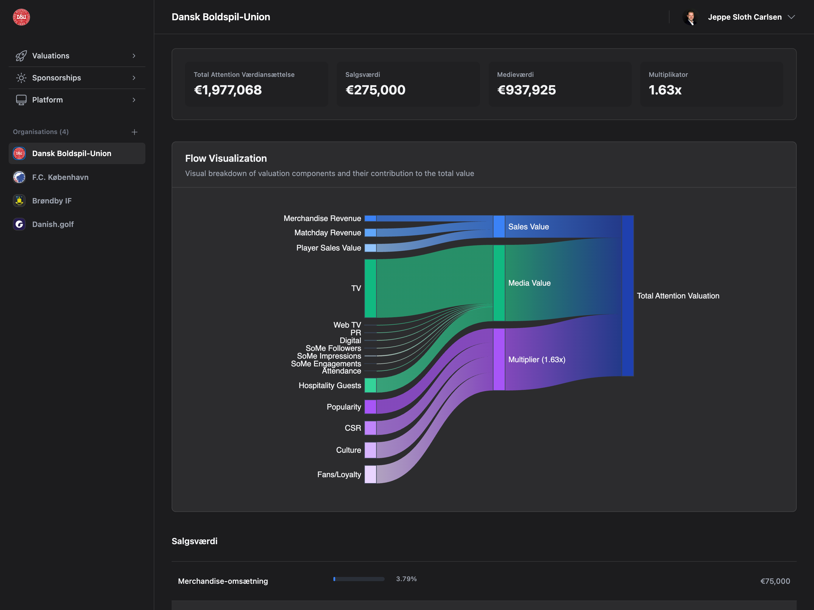 The Cash Flow Visualization plugin adds interactive Sankey (alluvial flow) charts to valuation details, showing revenue flow visualization from sources to total valuation.
## Overview
**Plan Required**: Professional or Enterprise plan
**Permission Required**: Automatically available with plan
**What it does**: Adds interactive Sankey (flow) charts to valuation details showing revenue flow visualization.
**Where it appears**: Valuation Details page → Sales section (configurable position)
**Author**: Valiyou
## Chart Types
### Sankey (Alluvial Flow) - Recommended
The Cash Flow Visualization plugin adds interactive Sankey (alluvial flow) charts to valuation details, showing revenue flow visualization from sources to total valuation.
## Overview
**Plan Required**: Professional or Enterprise plan
**Permission Required**: Automatically available with plan
**What it does**: Adds interactive Sankey (flow) charts to valuation details showing revenue flow visualization.
**Where it appears**: Valuation Details page → Sales section (configurable position)
**Author**: Valiyou
## Chart Types
### Sankey (Alluvial Flow) - Recommended
 **What it shows**:
* Flow of revenue from sources to categories to total
* Visual representation of how different revenue streams contribute
* Width of flows proportional to amounts
* Interactive hover tooltips with exact values
**Best for**:
* Visualizing revenue composition
* Identifying major revenue sources
* Understanding value distribution
* Professional presentation
### Waterfall
**What it shows**:
* Flow of revenue from sources to categories to total
* Visual representation of how different revenue streams contribute
* Width of flows proportional to amounts
* Interactive hover tooltips with exact values
**Best for**:
* Visualizing revenue composition
* Identifying major revenue sources
* Understanding value distribution
* Professional presentation
### Waterfall
 **What it shows**:
* Sequential breakdown of revenue components
* Cumulative effect of each category
* Step-by-step buildup to total valuation
**Best for**:
* Sequential analysis
* Traditional financial reporting
* Showing incremental contributions
### Custom
Configure your own visualization style with custom settings.
## Configuration
### Step 1: Enable Plugin
1. Navigate to **Platform** → **Plugins**
2. Find "Cash Flow Visualization (Sankey)" card
3. Click **"Enable"** button
4. Wait for status to change to "Enabled"
### Step 2: Configure Chart
1. Click **gear icon** (⚙️) in plugin card header
2. Configuration modal opens
**What it shows**:
* Sequential breakdown of revenue components
* Cumulative effect of each category
* Step-by-step buildup to total valuation
**Best for**:
* Sequential analysis
* Traditional financial reporting
* Showing incremental contributions
### Custom
Configure your own visualization style with custom settings.
## Configuration
### Step 1: Enable Plugin
1. Navigate to **Platform** → **Plugins**
2. Find "Cash Flow Visualization (Sankey)" card
3. Click **"Enable"** button
4. Wait for status to change to "Enabled"
### Step 2: Configure Chart
1. Click **gear icon** (⚙️) in plugin card header
2. Configuration modal opens
 **Configuration Options**:
#### Chart Type
* **Sankey (Alluvial Flow)** - Recommended
* **Waterfall** - Traditional waterfall chart
* **Custom** - Custom visualization
#### Chart Height
* Number of pixels (default: 600px)
* Recommended range: 400-800px
* Larger height = more vertical space for flows
#### Color Scheme
* **Default (Multi-color)** - Different colors for each category
* **Blue** - Single color palette (blues)
* **Green** - Single color palette (greens)
* **Purple** - Single color palette (purples)
* **Custom** - Define your own colors
#### Chart Position
* **Before Sales Details** - Recommended, appears above sales breakdown
* **After Sales Details** - Appears below sales breakdown
* **Top of Page** - Very first element on page
* **Bottom of Page** - Very last element on page
#### Display Options
**Checkboxes** (all checked by default):
* ☑️ **Show Legend** - Display color legend
* ☑️ **Show Tooltips** - Interactive hover tooltips
* ☑️ **Show Labels** - Data labels on flows
* ☑️ **Enable Interactivity** - Click/hover interactions
#### Animation Duration
* Milliseconds (default: 300ms)
* Recommended range: 100-500ms
* Higher value = slower, smoother animation
### Step 3: Save Configuration
Click **"Save Configuration"** to apply changes.
**Live Preview**: Changes apply immediately to all valuation pages. Open any valuation to see the updated chart.
## Using Cash Flow Visualization
### Step 1: Navigate to Valuation Details
Go to **Valuations** → Click any valuation
### Step 2: Locate Sankey Chart
**Configuration Options**:
#### Chart Type
* **Sankey (Alluvial Flow)** - Recommended
* **Waterfall** - Traditional waterfall chart
* **Custom** - Custom visualization
#### Chart Height
* Number of pixels (default: 600px)
* Recommended range: 400-800px
* Larger height = more vertical space for flows
#### Color Scheme
* **Default (Multi-color)** - Different colors for each category
* **Blue** - Single color palette (blues)
* **Green** - Single color palette (greens)
* **Purple** - Single color palette (purples)
* **Custom** - Define your own colors
#### Chart Position
* **Before Sales Details** - Recommended, appears above sales breakdown
* **After Sales Details** - Appears below sales breakdown
* **Top of Page** - Very first element on page
* **Bottom of Page** - Very last element on page
#### Display Options
**Checkboxes** (all checked by default):
* ☑️ **Show Legend** - Display color legend
* ☑️ **Show Tooltips** - Interactive hover tooltips
* ☑️ **Show Labels** - Data labels on flows
* ☑️ **Enable Interactivity** - Click/hover interactions
#### Animation Duration
* Milliseconds (default: 300ms)
* Recommended range: 100-500ms
* Higher value = slower, smoother animation
### Step 3: Save Configuration
Click **"Save Configuration"** to apply changes.
**Live Preview**: Changes apply immediately to all valuation pages. Open any valuation to see the updated chart.
## Using Cash Flow Visualization
### Step 1: Navigate to Valuation Details
Go to **Valuations** → Click any valuation
### Step 2: Locate Sankey Chart
 The chart appears at the configured position (default: before Sales Details section).
### Step 3: Interact with Chart
**Hover over flows**:
* See exact amounts and percentages
* Highlight specific revenue streams
* Tooltip shows: Source → Target: Amount (%)
**Click on flows**:
* Focus on specific revenue stream
* Dim other flows for clarity
* Click again to reset
**Legend**:
* Shows all categories and colors
* Click legend items to toggle visibility
* Useful for focusing on specific categories
## What the Chart Shows
### Revenue Sources
**Sales Revenue**:
* Transfers (Player Sales)
* Merchandise Sales
* Ticket Sales
**Media Revenue**:
* Print Media
* Digital Media
* Social Media
* Broadcast Media
**Brand Revenue**:
* Brand Exposure
* Sponsorship Coverage
* Marketing Value
### Flow Structure
```
Revenue Sources → Categories → Total Valuation
↓ ↓ ↓
Individual Sales/Media/ Final Total
Amounts Brand (summed)
```
## Customization Examples
### Minimalist Configuration
**Goal**: Clean, simple chart with minimal distractions
**Settings**:
* Chart Type: Sankey
* Height: 500px
* Color Scheme: Blue
* Position: Before Sales Details
* Show Legend: ❌ Unchecked
* Show Tooltips: ✅ Checked
* Show Labels: ❌ Unchecked
* Enable Interactivity: ✅ Checked
* Animation: 200ms
### Detailed Analysis Configuration
**Goal**: Maximum information for deep analysis
**Settings**:
* Chart Type: Sankey
* Height: 800px
* Color Scheme: Default (Multi-color)
* Position: Before Sales Details
* Show Legend: ✅ Checked
* Show Tooltips: ✅ Checked
* Show Labels: ✅ Checked
* Enable Interactivity: ✅ Checked
* Animation: 300ms
### Presentation Mode
**Goal**: Professional for client presentations
**Settings**:
* Chart Type: Sankey
* Height: 700px
* Color Scheme: Purple (brand colors)
* Position: Top of Page
* Show Legend: ✅ Checked
* Show Tooltips: ✅ Checked
* Show Labels: ✅ Checked
* Enable Interactivity: ❌ Unchecked (static)
* Animation: 500ms (smooth)
## Benefits
Understand revenue composition at a glance
Impress stakeholders with interactive visualizations
Drill down into specific revenue streams
Match your brand colors and style
## Troubleshooting
### Sankey Chart Not Showing
**Check**:
* ✅ Plugin enabled (green "Enabled" badge)
* ✅ Professional/Enterprise plan active
* ✅ Viewing Valuation Details page (not list)
* ✅ Chart position setting (might be bottom of page)
**Fix**:
1. Enable Cash Flow Visualization plugin
2. Upgrade plan if needed
3. Open a single valuation details page
4. Check configuration position setting
5. Scroll down if position set to bottom
### Chart Too Small/Large
**Problem**: Chart height doesn't fit your needs
**Fix**:
1. Open plugin configuration
2. Adjust **Chart Height** value:
* Too small: Increase to 700-800px
* Too large: Decrease to 400-500px
3. Save configuration
4. Refresh valuation page
### Colors Don't Match Brand
**Problem**: Default colors don't match your brand
**Fix**:
1. Open plugin configuration
2. Select **Color Scheme**:
* Blue: Corporate blue palette
* Green: Success/growth theme
* Purple: Premium/luxury theme
* Custom: Define your own (future)
3. Save configuration
### Chart Not Interactive
**Problem**: Hover/click not working
**Fix**:
1. Open plugin configuration
2. Check **Enable Interactivity** is checked ✅
3. Save configuration
4. Refresh valuation page
5. Clear browser cache if still not working
### Chart Blocks Other Content
**Problem**: Chart takes up too much space
**Fix**:
1. Open plugin configuration
2. Reduce **Chart Height** to 400-500px
3. Uncheck **Show Legend** if not needed
4. Uncheck **Show Labels** to reduce clutter
5. Save configuration
## Best Practices
### 1. Choose Right Chart Type
**Use Sankey when**:
* ✅ Visualizing revenue flow
* ✅ Showing relationships between sources
* ✅ Professional presentations
* ✅ Interactive exploration needed
**Use Waterfall when**:
* ✅ Sequential breakdown preferred
* ✅ Traditional financial reporting
* ✅ Showing incremental contributions
### 2. Optimize Chart Height
**Guidelines**:
* **400-500px**: Compact view, less scroll
* **600px**: Default, balanced
* **700-800px**: Detailed view, more vertical space
* **900px+**: Only for large screens, presentations
### 3. Balance Interactivity
**Enable all options for**:
* Internal analysis
* Data exploration
* Training purposes
**Disable some options for**:
* Client presentations (disable labels)
* Print/PDF export (disable interactivity)
* Minimal design (disable legend)
### 4. Match Your Brand
Use consistent colors across all valuations:
1. Choose color scheme that matches brand
2. Save configuration
3. All valuations use same style
4. Professional, consistent appearance
### 5. Position Strategically
**Before Sales Details** (default):
* ✅ Immediate visual impact
* ✅ Sets context for detailed breakdown
* ✅ Most logical flow (overview → details)
**After Sales Details**:
* ✅ Reinforces detailed numbers
* ✅ Summary visualization
**Top of Page**:
* ✅ Maximum visibility
* ✅ First thing users see
**Bottom of Page**:
* ✅ Doesn't distract from main content
* ✅ Optional exploration
## FAQ
No, the plugin applies to all valuations when enabled. To hide:
1. Disable the plugin temporarily
2. Or position it at bottom of page
3. Future: Per-valuation toggle planned
Yes! The chart is generated from live valuation data. When you update sales, media, or brand values, the chart automatically reflects the changes on page refresh.
Not directly. To export:
1. Take screenshot of chart
2. Or use browser print-to-PDF (includes chart)
3. Or right-click chart → "Save image as" (if available)
Future: Export button planned
You selected a single-color palette (Blue, Green, or Purple). To get multiple colors:
1. Open plugin configuration
2. Select **Default (Multi-color)** color scheme
3. Save configuration
Not yet. Current color schemes:
* Default: Automatic color assignment
* Blue/Green/Purple: Single palette
Future: Custom color mapping planned
Yes! The chart is responsive and works on mobile devices. However:
* Smaller screen = less detail visible
* Touch interactions replace hover
* Consider reducing height for mobile (automatic)
## Related Documentation
* [Plugins Overview](/platform/plugins) - All available plugins
* [Valuation Details](/valuations/valuation-details) - Full valuation page guide
* [Create Valuation](/valuations/create-valuation) - How to create valuations
* [Reports](/valuations/reports) - Multi-valuation comparison
The chart appears at the configured position (default: before Sales Details section).
### Step 3: Interact with Chart
**Hover over flows**:
* See exact amounts and percentages
* Highlight specific revenue streams
* Tooltip shows: Source → Target: Amount (%)
**Click on flows**:
* Focus on specific revenue stream
* Dim other flows for clarity
* Click again to reset
**Legend**:
* Shows all categories and colors
* Click legend items to toggle visibility
* Useful for focusing on specific categories
## What the Chart Shows
### Revenue Sources
**Sales Revenue**:
* Transfers (Player Sales)
* Merchandise Sales
* Ticket Sales
**Media Revenue**:
* Print Media
* Digital Media
* Social Media
* Broadcast Media
**Brand Revenue**:
* Brand Exposure
* Sponsorship Coverage
* Marketing Value
### Flow Structure
```
Revenue Sources → Categories → Total Valuation
↓ ↓ ↓
Individual Sales/Media/ Final Total
Amounts Brand (summed)
```
## Customization Examples
### Minimalist Configuration
**Goal**: Clean, simple chart with minimal distractions
**Settings**:
* Chart Type: Sankey
* Height: 500px
* Color Scheme: Blue
* Position: Before Sales Details
* Show Legend: ❌ Unchecked
* Show Tooltips: ✅ Checked
* Show Labels: ❌ Unchecked
* Enable Interactivity: ✅ Checked
* Animation: 200ms
### Detailed Analysis Configuration
**Goal**: Maximum information for deep analysis
**Settings**:
* Chart Type: Sankey
* Height: 800px
* Color Scheme: Default (Multi-color)
* Position: Before Sales Details
* Show Legend: ✅ Checked
* Show Tooltips: ✅ Checked
* Show Labels: ✅ Checked
* Enable Interactivity: ✅ Checked
* Animation: 300ms
### Presentation Mode
**Goal**: Professional for client presentations
**Settings**:
* Chart Type: Sankey
* Height: 700px
* Color Scheme: Purple (brand colors)
* Position: Top of Page
* Show Legend: ✅ Checked
* Show Tooltips: ✅ Checked
* Show Labels: ✅ Checked
* Enable Interactivity: ❌ Unchecked (static)
* Animation: 500ms (smooth)
## Benefits
Understand revenue composition at a glance
Impress stakeholders with interactive visualizations
Drill down into specific revenue streams
Match your brand colors and style
## Troubleshooting
### Sankey Chart Not Showing
**Check**:
* ✅ Plugin enabled (green "Enabled" badge)
* ✅ Professional/Enterprise plan active
* ✅ Viewing Valuation Details page (not list)
* ✅ Chart position setting (might be bottom of page)
**Fix**:
1. Enable Cash Flow Visualization plugin
2. Upgrade plan if needed
3. Open a single valuation details page
4. Check configuration position setting
5. Scroll down if position set to bottom
### Chart Too Small/Large
**Problem**: Chart height doesn't fit your needs
**Fix**:
1. Open plugin configuration
2. Adjust **Chart Height** value:
* Too small: Increase to 700-800px
* Too large: Decrease to 400-500px
3. Save configuration
4. Refresh valuation page
### Colors Don't Match Brand
**Problem**: Default colors don't match your brand
**Fix**:
1. Open plugin configuration
2. Select **Color Scheme**:
* Blue: Corporate blue palette
* Green: Success/growth theme
* Purple: Premium/luxury theme
* Custom: Define your own (future)
3. Save configuration
### Chart Not Interactive
**Problem**: Hover/click not working
**Fix**:
1. Open plugin configuration
2. Check **Enable Interactivity** is checked ✅
3. Save configuration
4. Refresh valuation page
5. Clear browser cache if still not working
### Chart Blocks Other Content
**Problem**: Chart takes up too much space
**Fix**:
1. Open plugin configuration
2. Reduce **Chart Height** to 400-500px
3. Uncheck **Show Legend** if not needed
4. Uncheck **Show Labels** to reduce clutter
5. Save configuration
## Best Practices
### 1. Choose Right Chart Type
**Use Sankey when**:
* ✅ Visualizing revenue flow
* ✅ Showing relationships between sources
* ✅ Professional presentations
* ✅ Interactive exploration needed
**Use Waterfall when**:
* ✅ Sequential breakdown preferred
* ✅ Traditional financial reporting
* ✅ Showing incremental contributions
### 2. Optimize Chart Height
**Guidelines**:
* **400-500px**: Compact view, less scroll
* **600px**: Default, balanced
* **700-800px**: Detailed view, more vertical space
* **900px+**: Only for large screens, presentations
### 3. Balance Interactivity
**Enable all options for**:
* Internal analysis
* Data exploration
* Training purposes
**Disable some options for**:
* Client presentations (disable labels)
* Print/PDF export (disable interactivity)
* Minimal design (disable legend)
### 4. Match Your Brand
Use consistent colors across all valuations:
1. Choose color scheme that matches brand
2. Save configuration
3. All valuations use same style
4. Professional, consistent appearance
### 5. Position Strategically
**Before Sales Details** (default):
* ✅ Immediate visual impact
* ✅ Sets context for detailed breakdown
* ✅ Most logical flow (overview → details)
**After Sales Details**:
* ✅ Reinforces detailed numbers
* ✅ Summary visualization
**Top of Page**:
* ✅ Maximum visibility
* ✅ First thing users see
**Bottom of Page**:
* ✅ Doesn't distract from main content
* ✅ Optional exploration
## FAQ
No, the plugin applies to all valuations when enabled. To hide:
1. Disable the plugin temporarily
2. Or position it at bottom of page
3. Future: Per-valuation toggle planned
Yes! The chart is generated from live valuation data. When you update sales, media, or brand values, the chart automatically reflects the changes on page refresh.
Not directly. To export:
1. Take screenshot of chart
2. Or use browser print-to-PDF (includes chart)
3. Or right-click chart → "Save image as" (if available)
Future: Export button planned
You selected a single-color palette (Blue, Green, or Purple). To get multiple colors:
1. Open plugin configuration
2. Select **Default (Multi-color)** color scheme
3. Save configuration
Not yet. Current color schemes:
* Default: Automatic color assignment
* Blue/Green/Purple: Single palette
Future: Custom color mapping planned
Yes! The chart is responsive and works on mobile devices. However:
* Smaller screen = less detail visible
* Touch interactions replace hover
* Consider reducing height for mobile (automatic)
## Related Documentation
* [Plugins Overview](/platform/plugins) - All available plugins
* [Valuation Details](/valuations/valuation-details) - Full valuation page guide
* [Create Valuation](/valuations/create-valuation) - How to create valuations
* [Reports](/valuations/reports) - Multi-valuation comparison